Tab Design Customization
Customizing tab designs within Navitabs macros
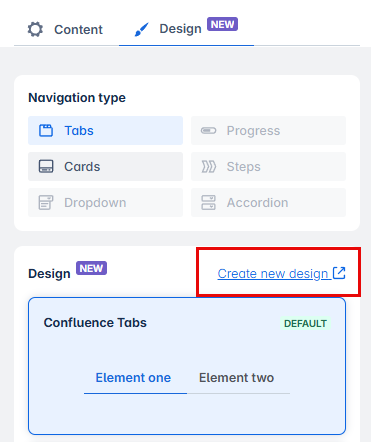
You can find a “Design“ tab within the Wizard Macro. In this tab, you can have access to more customization options, including Cards, Dropdown (only available for the Tab Wizard) and more in development.
 Note: This window is opened by default when opening the macro Tab Group.
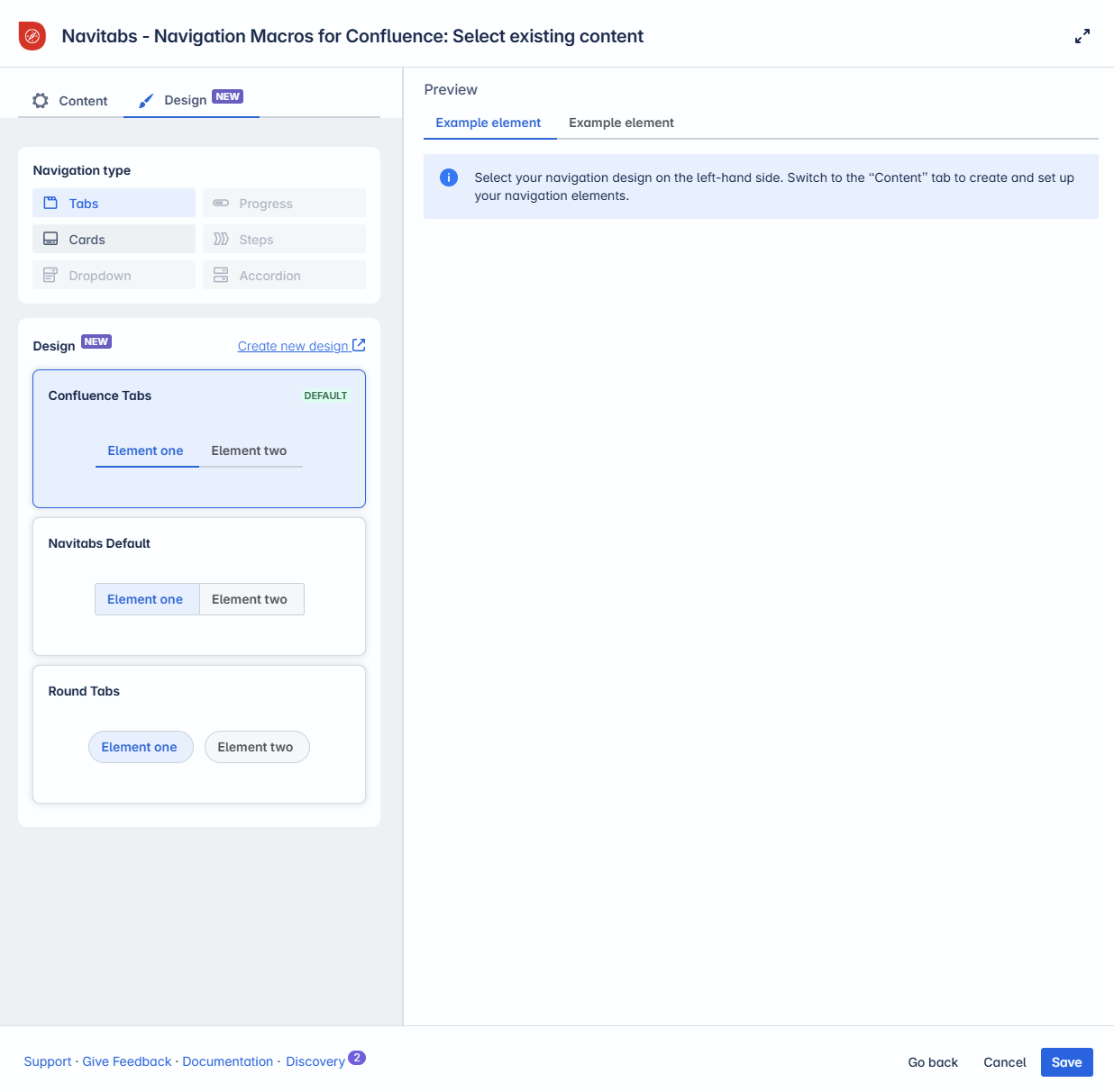
Which designs are available?
NEW The list of available designs has expanded, allowing you to present content in a style that best suits your needs. Choose between Tabs, Cards and Dropdown, or create your own custom design.
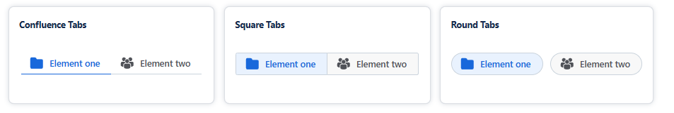
Tabs
Display content using the classic tab layout.
Choose from built-in styles: Confluence Tabs, Square Tabs, or Round Tabs.
Create your own tab design using this layout as a template.
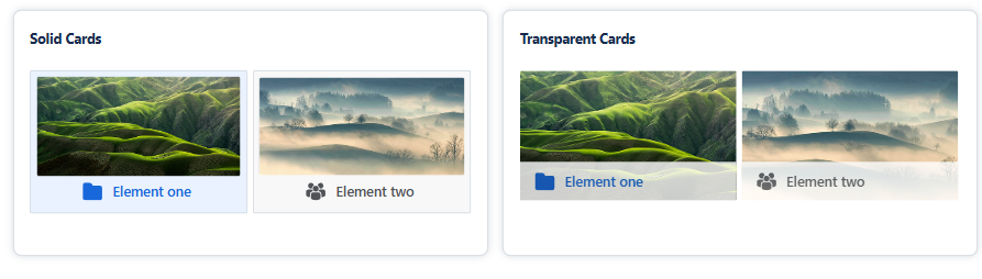
Cards
Present tabs as visual cards with images.
Use default stock images, upload your own, or remove images entirely.
Choose between Solid and Transparent styles.
Create and save your own card design using this format.
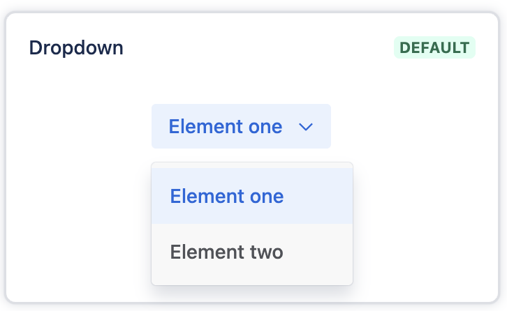
Dropdown
Display tabs in a tidy-looking dropdown menu.
Choose between a preset design or use a tab design for custom colors, corner radius, and font styles.
Coming soon
We’re actively exploring new elements that will be released in upcoming updates.
Have ideas or feedback? We’d love to hear from you—share your suggestions with us!

Accessing the Tab Design settings
There are two ways to access the Tab Design:
Via the app menu
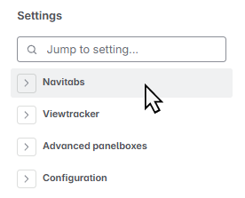
As an Administrator, head to the Confluence Settings area and locate Navitabs.
Via the macro settings
Within any Navitabs macro, select the option “Create a new tab design” (group restrictions might prevent this option from appearing).
Creating and managing Tab designs
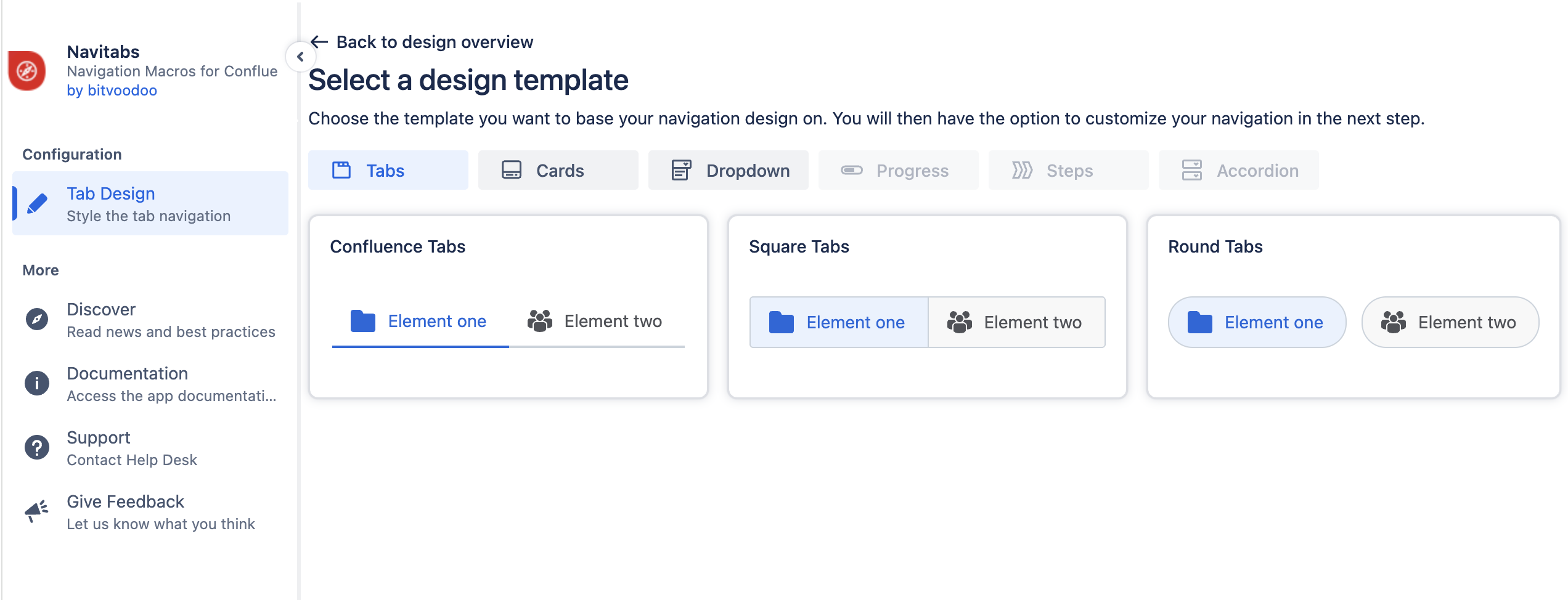
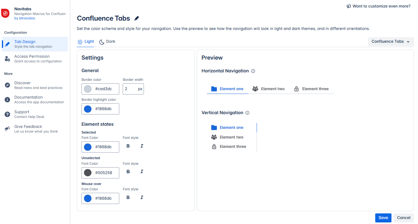
In the Tab Design screen, tap the “Create New Design” button to create custom tab styles.
Choose from available templates to get started quickly.
Currently, Tabs, Cards, and Dropdown are available. More are coming soon.
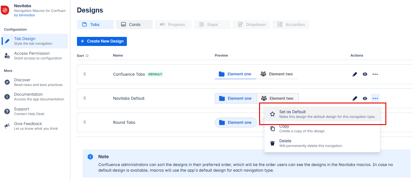
Reorder designs using drag-and-drop — the new order will be reflected in the design selection menu.
Click on individual elements to customize colors, borders, navigation style and spacing.
Deactivate designs to make them unavailable for use without deleting them.
Use the options to set a design as Default, Copy it, or delete it permanently.
Setting a default tab design (administrator only)
Administrators can define which tab design is preselected when a macro is added to a page for the first time.
For Tabs, the default design is called Confluence Tabs
For Cards, the default design is called Solid Cards
For Dropdown, the default design is called Dropdown
Note: Changing the default design will update all existing Tab Navigations that are using the previous default to the new default design.
Tab navigation using a specifically selected design (other than the default) will not be affected and will retain its assigned design.
The new default design will be automatically preselected in the macro settings and labeled as "Default."
More administrator options
Administrators can:
Hide designs from the macro selection menu by clicking the eye icon.
Copy custom designs to create new ones without altering the original.
Delete custom designs by opening the actions menu (represented by an ellipsis) and selecting "Delete."
Reorder designs using drag and drop.
Customizing a tab design
Within the Customization menu, you can:
Choose a template as a starting point. Currently available options: Tabs and Cards (more coming soon).
Optionally, name your design.
Customize the design using various settings (e.g., divider style, font color). A live preview is shown for both horizontal and vertical tabs.
Select colors compatible with both Light and Dark themes.
Save your new tab design.
Once saved, it becomes available to all users.
Note: Administrators can choose to restrict these actions to members of specific user groups (see the next section).
Manage permission for tab design
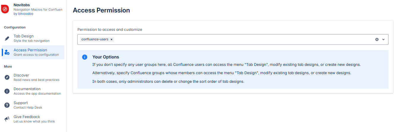
By default, all Confluence users can access the Tab Design menu to modify existing designs or create new ones.
Administrators can restrict access by specifying which user groups are allowed to use this menu. This can be configured in the Access Permissions section, located below the Tab Design menu.
Changes are saved automatically and take effect immediately.