Localtab Macro
Structure your page's content in tabs. Must be used within a Localtab-Group macro.
Localtab Macro
When to use Localtab Macros
This macro is helpful if you want to:
structure a long Confluence page to prevent excess scrolling
put additional information in tabs instead of displaying them in the main content (eg. related pages, Jira issues, page properties, or other macros)
How to use the Localtab Macro
Place multiple Localtab macros inside a Localtab-Group macro.
How this looks in the editor:
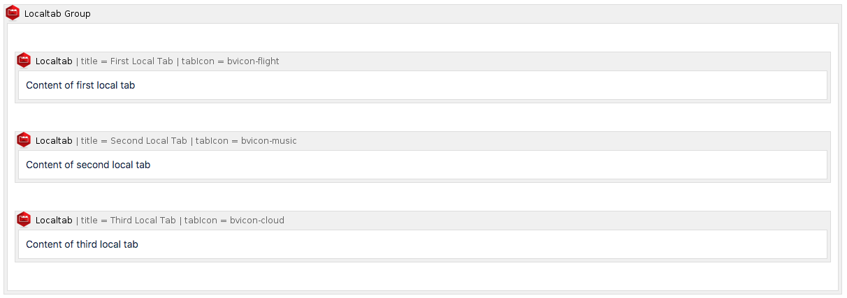
Screenshot of page in edit mode
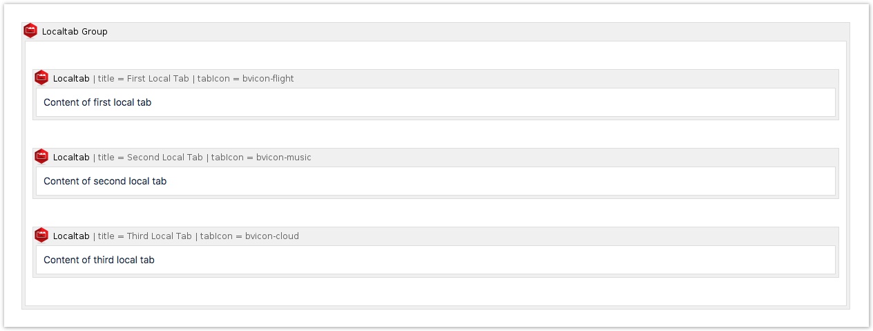
How this looks once the page is published:

Screenshot of published page
Settings of the Localtab Macro
Name | Description |
|---|---|
Title | The title of the tab. This setting is required. |
Active | Specify whether this tab should be active when the page is loaded. Only one tab can be set to active. |
Link ID | Set an ID to link to this tab (optional). |
Tab icon | Display an icon next to the tab title. Choose from a big icon library. See details. |
Tab image URL | Display an icon next to the tab title. Use an external URL. See details. |
Localtab-Group Macro
This macro is a wrapper macro. It generates tab navigation with the individual Localtab macros that are inserted.
Example
Settings of the Localtab-Group Macro
Name | Description |
|---|---|
Vertical orientation | Tick the box to display the tabs vertically. By default, tabs are oriented horizontally. |
Width | The width of the vertical tabs in pixels. The default is 150 pixels. |
Lock position | If checked, the vertical tabs will scroll with the content. |
Tab style | Define how tabs look like in the UI. As a user, you can switch between the tab style "Atlassian tabs" (default) and "index cards". Switch between the styles by editing the macro and changing the "Tab style".  Tab style "Atlassian tabs" is the standard Atlassian tab layout. It is used as default.  Tab style "index cards" displays the tabs as cards (2D).  |
FAQ
Related macros
- Childtabs Macro
Comprehensive guide on using the Childtabs Macro in Navitabs, detailing features like vertical orientation, tab style, and left truncation settings.
- Localtab Macro
Structure your page's content in tabs. Must be used within a Localtab-Group macro.