Tab Wizard
This macro allows you to create tabbed navigation using existing Confluence content—such as pages, whiteboards, databases, Smart Links, or even embedded external content.
You can build tabs based on labels, define a parent page to pull in child pages as tabs, or manually create custom tabs where you can insert content, iFrames, HTML, or other embedded elements.
Using this macro
New Confluence editor
Edit your page, type “/Tab Wizard” and choose the macro “Tab Wizard”.
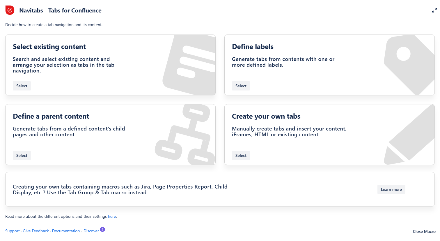
Select one of the four options to create your new tab navigation in the overlay. The options are explained in detail below.
After you’ve selected it, the overlay will adapt to show you all the options.
If you feel you have made the wrong selection, you can always return to the Tab Wizard by using the “Go back” button at the bottom of the overlay.
If you don’t want to add tabs, click “Cancel” to close the Tab Wizard.
 The Tab Wizard is not the right choice if you want to create tabs containing Confluence macros like Child Display, Jira, Page Properties Reports, etc. Please use the Tab Group and Tab Macro instead.
Legacy Confluence editor
We strongly recommend using the Tab Wizard macro in the new Cloud editor. However, if you need to use it in the Legacy editor, proceed as follows:
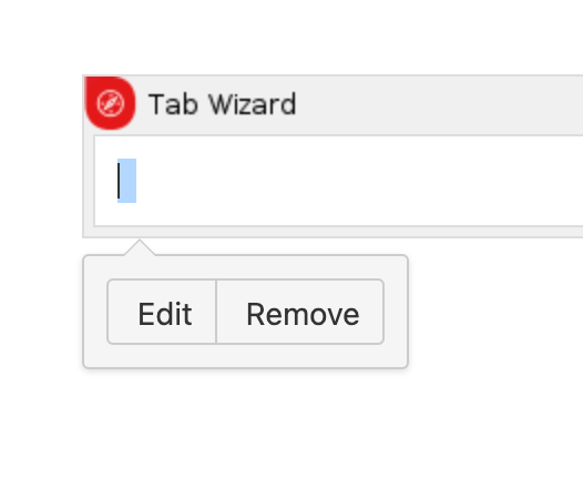
Insert the Tab Wizard by using {Tab Wizard.
Click into the macro and select “Edit”. This will open the Tab Wizard overlay.
Choose the right macro setting (see the documentation below).
Fill in your tabs in the macro overlay and tap “Save”.
Save your page to see the tab navigation in action.
⚠️ Don’t edit tabs' content in this view. If you want to modify something, open the Tab Wizard interface again by tapping the macro and selecting “Edit”.

Tips for more space
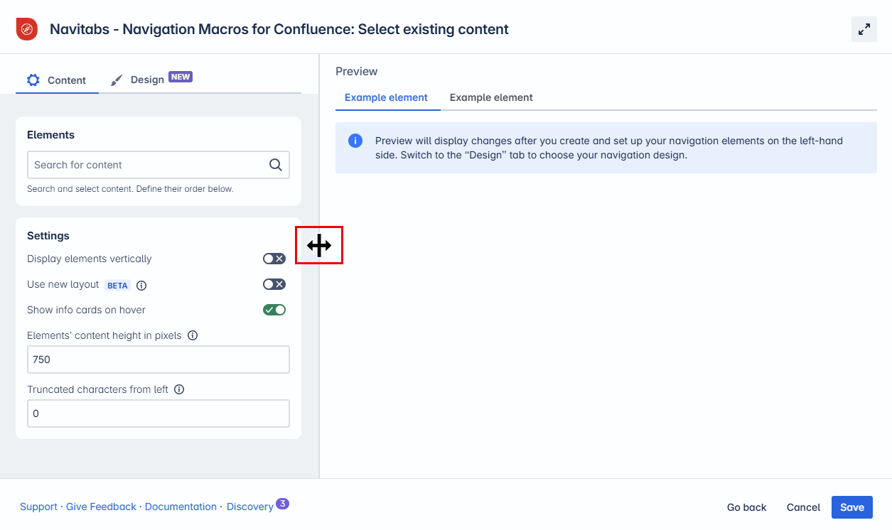
You can expand the macro overlay to span the entire screen width.
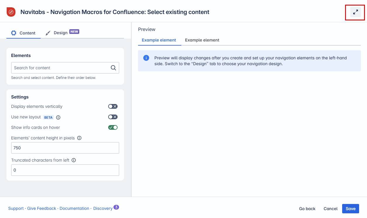
You can also shrink the macro settings on the left side.
Tips for Navigation
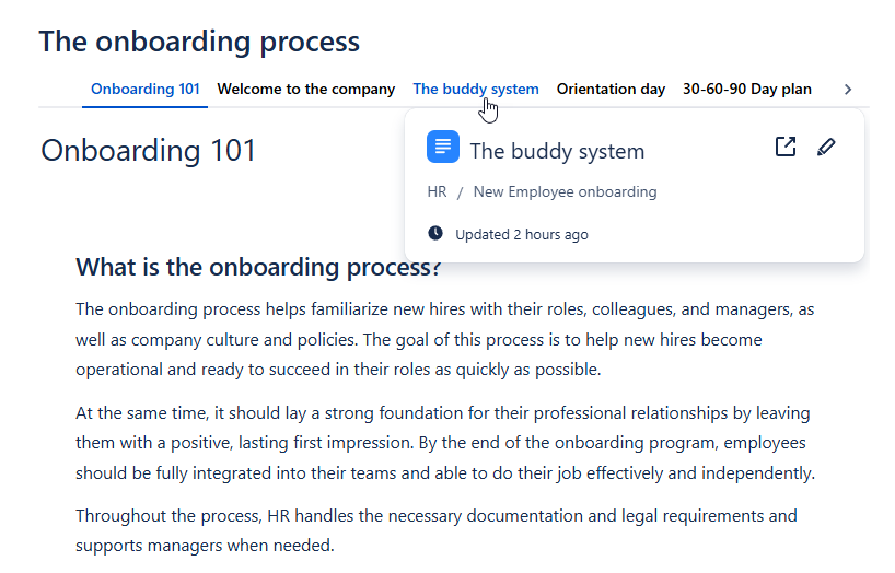
With the “Show info cards on hover” setting enabled, users can view more detailed information about linked tabs. This is especially useful if the current Tab navigation is based on pages spread across various locations or spaces.
Note: This feature applies to macros that gather existing content and is unavailable for tabs with created content, like “Tab Groups” or the “Tab Wizard: Create Your Own Tabs” option.
When hovering over the tabs, a card will show breadcrumb navigation to indicate the page origin, the last update date, and quick-access options to view or edit the content directly.
This feature can be toggled off in the settings. See below for how to adjust this in each macro.
How to add tabs in a Confluence page
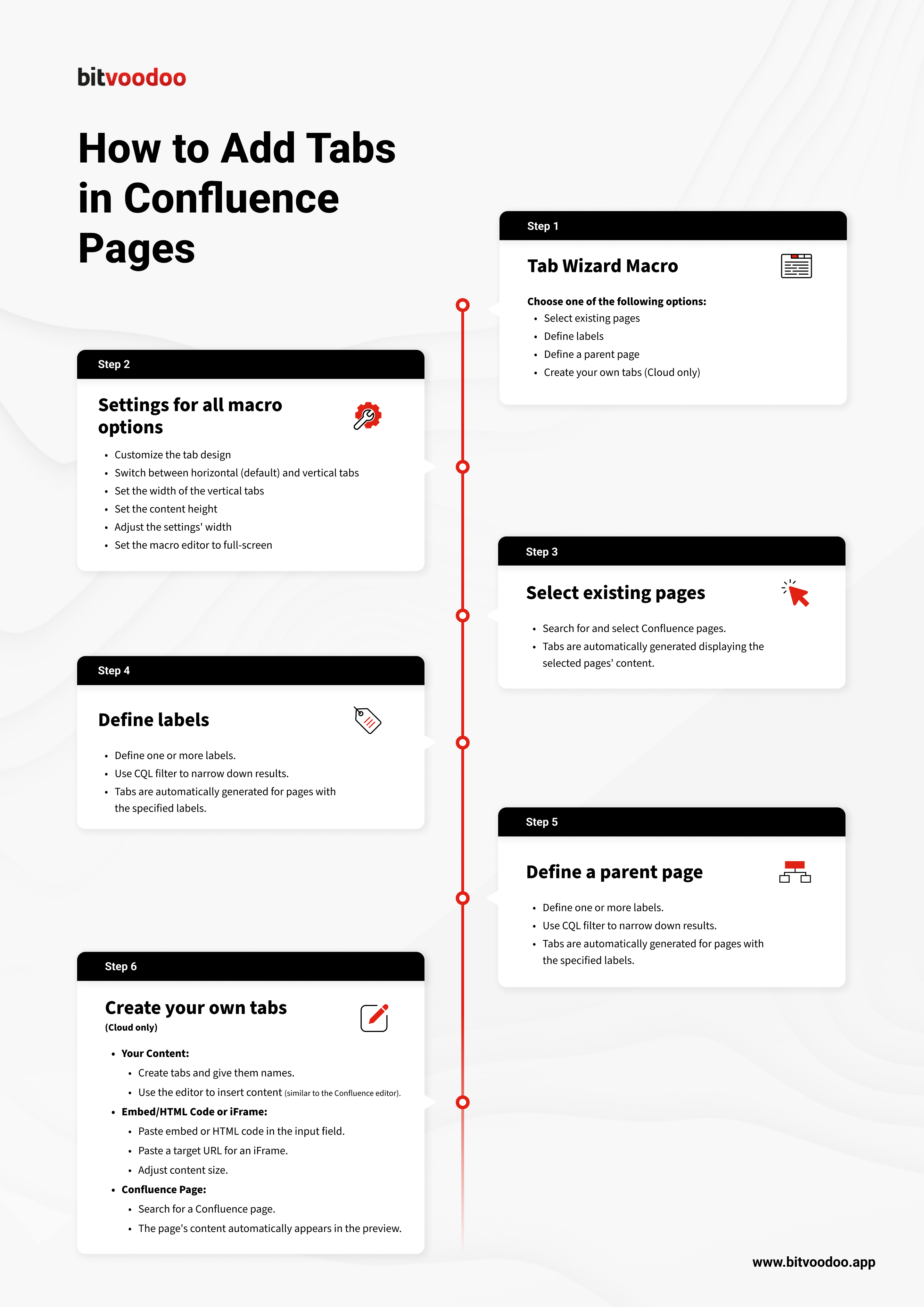
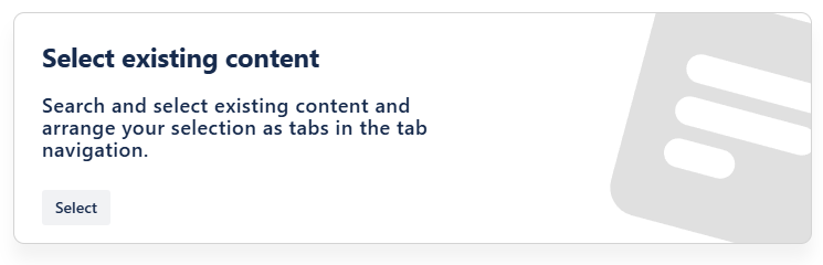
Select existing content
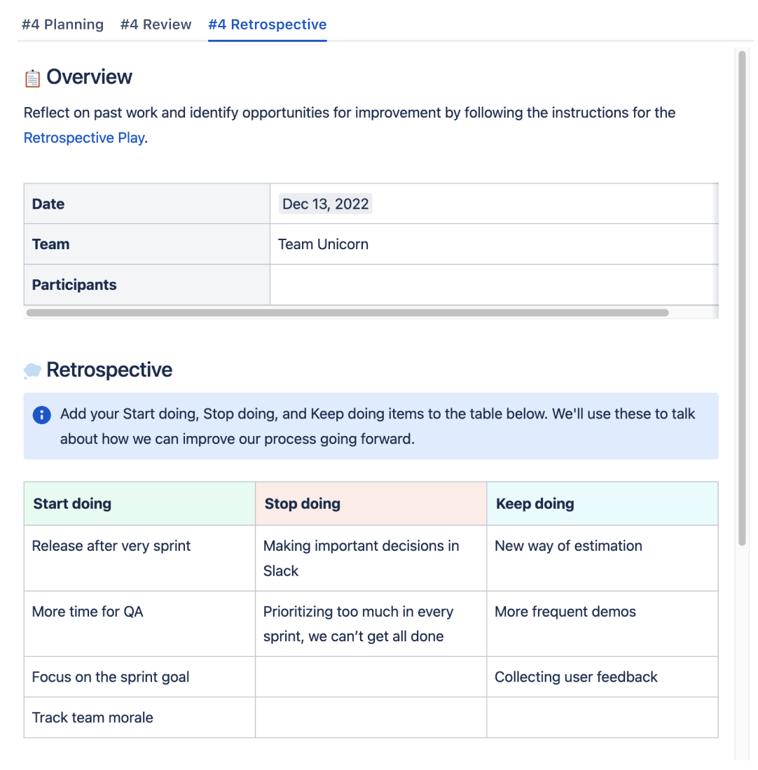
How it works: Search for and select existing Confluence content. Tabs displaying that content will automatically be generated.
How to use this macro
Insert the Tab Wizard macro on a page.
Tap “Select existing content” in the Tab Wizard.
In the field “Content,” type in the name of a specific page, whiteboard, database or smartlink*.
Repeat for any other content you want to display as a tab.
Drag & drop page names to choose the order of the tabs.
Adapt the general settings (see options below).
Use the preview to check if everything looks as expected.
Tap “Save” and publish the page.
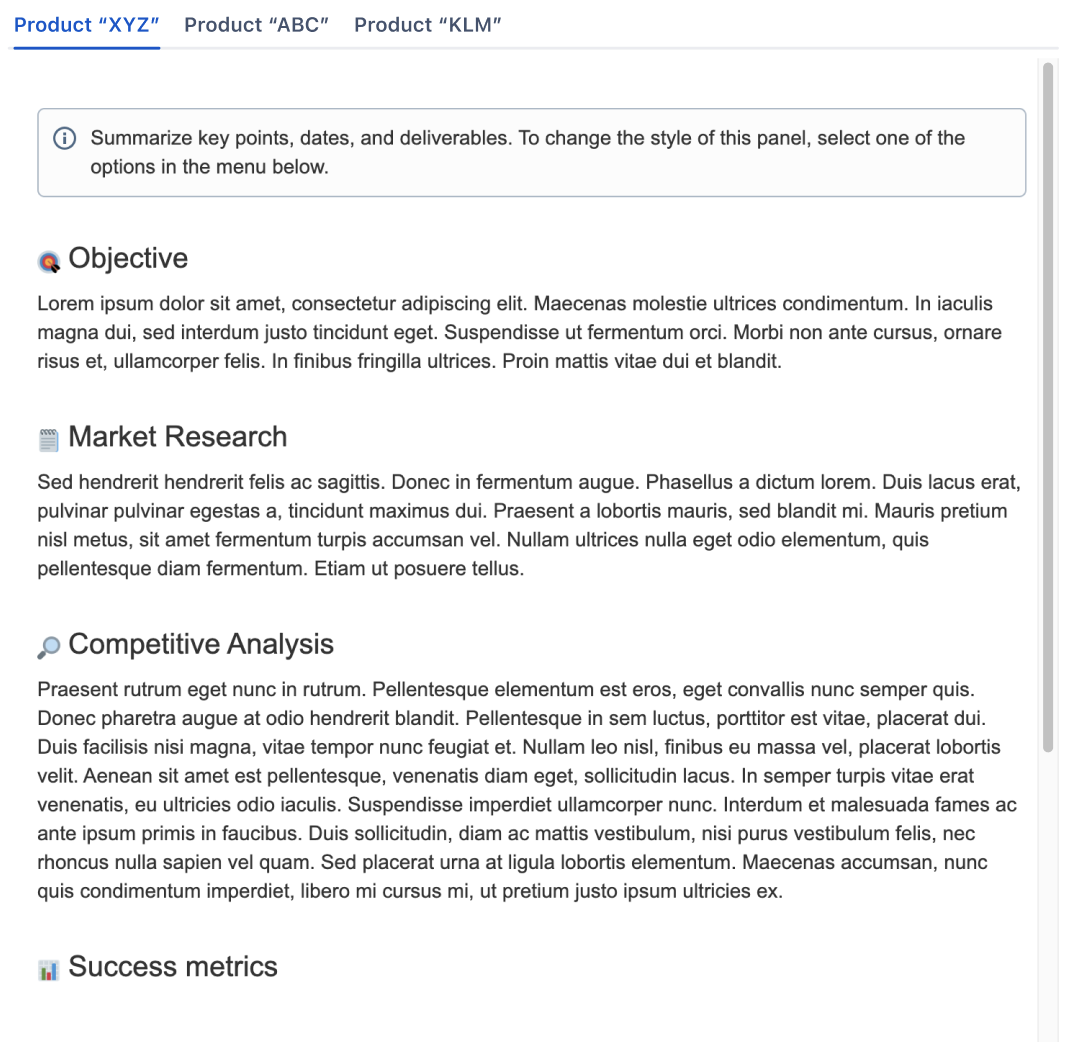
Result: The content of the selected pages is displayed as tabs on the page.
General settings of this macro
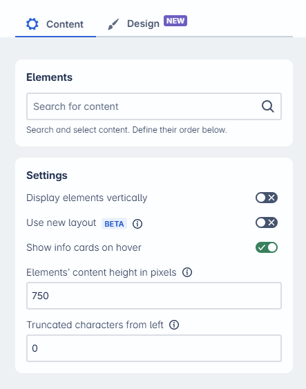
Elements:
Search and select existing content (page, blog post, whiteboard, database or SmartLink*).
Settings
Display tabs vertically: Tabs are displayed horizontally by default. Enable this toggle to switch to a vertical layout.
Use new layout (Beta): Unlock advanced features with the new layout. See Tab Content Layout (Beta) for more details.
Show info cards on hover: When hovering over a tab, display an info card with the page title, origin, last updated date, and shortcuts to view or edit the page
Element content height (in pixels): Adjust the height of tab content areas. Default is 750 px. Helpful for longer content.
Truncate characters from the left: Enter the number of characters to trim from the beginning of tab titles—useful for long titles. By default, full titles are shown.
Designs
Select and apply a predefined Tab Design, or create and customize your own to match your content style.
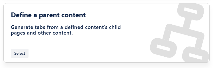
Define a parent content
How it works: Define the parent page. This will automatically generate tabs displaying the children's content.
How to use this macro
Insert the Tab Wizard macro on a page.
Select “Define a parent content” in the Tab Wizard.
In the field “Root,” enter the specific parent content.
Content that can be selected are pages, whiteboards, databases, and smartlinks*.
Leave the field blank to use the current page.
Adapt the general settings (see options below).
Use the preview to check if everything looks as expected.Tap “Save” and publish the page.
Result: The children of the selected parent, with all their content, are displayed as tabs on the page.
General settings of this macro
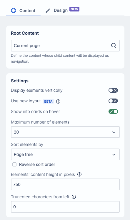
Root Content
Select the page from which the navigation will be created. The default value is the Current Page.
Settings
Display tabs vertically: Tabs are displayed horizontally by default. Enable this toggle to switch to a vertical layout.
Use new layout (Beta): Unlock advanced features with the new layout. See Tab Content Layout (Beta) for more details.
Show info cards on hover: When hovering over a tab, display an info card with the page title, origin, last updated date, and shortcuts to view or edit the page.
Max. number of tabs: Define how many tabs to render (1–50). The default is 20.
Sort elements by:
Alphabetically (A–Z) (default)
Creation date (newest first)
Modification date (newest first)
Page tree order (mirrors the page hierarchy from the selected root page)
Reverse tab sort order: Invert the selected sort order.
Element content height (in pixels): Adjust the height of tab content areas. Default is 750 px. Helpful for longer content.
Truncate characters from the left: Enter the number of characters to trim from the beginning of tab titles—useful for long titles. By default, full titles are shown.
Tab Design
Select and apply a predefined Tab Design, or create and customize your own to match your content style.
Note: This functionality was previously part of the Childtabs macro. It is now integrated into the Tab Wizard for a more streamlined experience.
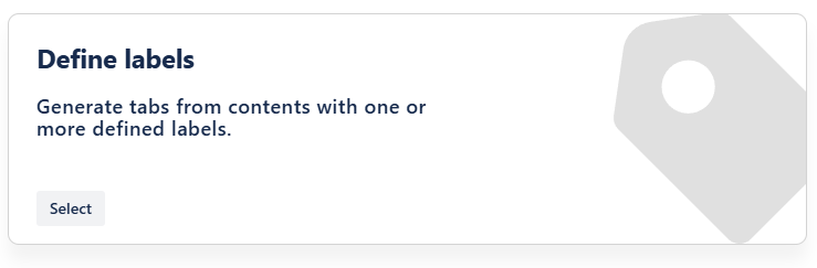
Define labels
This was previously done with the Labeltabs macro.
How it works: Define one or various labels. This will automatically generate tabs of pages containing the label(s) and display their content.
How to use this macro
Insert the Tab Wizard macro on a page.
Select “Define labels” in the Tab Wizard.
In the field “Labels”, insert the label(s) that the pages should contain.
Optional: Use a CQL query to narrow down the results. For example, you can filter for the space “Spacename” using this query:
CODEspace = "Spacename"Optional: Adapt the general settings (see options below).
Use the preview to verify that everything appears as expected.Tap “Save” and publish the page.
Result: The pages containing the label(s) with all their content are displayed as tabs on the page.
General settings of this macro
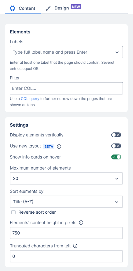
Elements:
Enter one or more labels, separated by commas. All pages containing any of the specified labels will be displayed as individual tabs.
Filter
Refine the selection further by entering a custom CQL (Confluence Query Language) query to control which labeled pages appear.
Settings
Display tabs vertically: Tabs are displayed horizontally by default. Enable this toggle to switch to a vertical layout.
Use new layout (Beta): Unlock advanced features with the new layout. See Tab Content Layout (Beta) for more details.
Show info cards on hover: When hovering over a tab, display an info card with the page title, origin, last updated date, and shortcuts to view or edit the page.
Max. number of tabs: Define how many tabs to render (1–50). The default is 20.
Sort elements by:
Alphabetically (A–Z) (default)
Creation date (newest first)
Modification date (newest first)
Page tree order (mirrors the page hierarchy from the selected root page)
Reverse tab sort order: Invert the selected sort order.
Element content height (in pixels): Adjust the height of tab content areas. Default is 750 px. Helpful for longer content.
Truncate characters from the left: Enter the number of characters to trim from the beginning of tab titles—useful for long titles. By default, full titles are shown.
Tab Design
Select and apply a predefined Tab Design, or create and customize your own to match your content style.
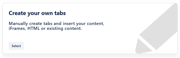
Create your own tabs
This used to be done with the Tabs Editor, but has been extended with the Tab Wizard.
How it works: Create tab content individually or mix individual tab content with existing Confluence pages. Options include:
Your content: Use the editor to create content from scratch
Embed or HTML Code
iFrame
Existing Confluence content (pages, whiteboards, databases, smartlinks*).
How to use this macro
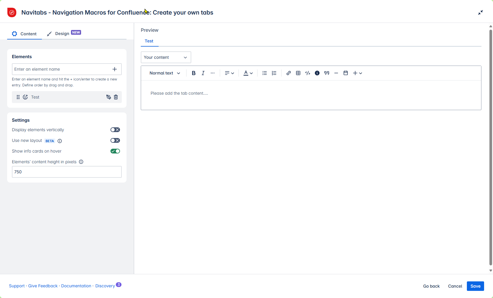
Insert the Tab Wizard macro on a page.
Select “Create your own tabs” in the Tab Wizard.
In “Tabs & Tab Names,” first write a name for your tab. Hit “Enter” or tap the + icon to add the tab.
Repeat for any number of custom tabs.
Drag & drop tab names to choose the order of the tabs.
On the right side of the macro, select the type of content you want to add from the drop-down (details are provided below).
Adapt the general settings (see options below).
Tap “Save” and publish the page.
General settings of this macro
The following settings are identical for the macro options “Your content,” “Embed,” “iFrame,” and “Confluence content.”
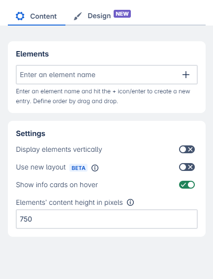
Elements
Enter one or more labels, separated by commas. All pages containing any of the specified labels will be displayed as individual tabs.
Settings
Display tabs vertically: Tabs are displayed horizontally by default. Enable this toggle to switch to a vertical layout.
Use new layout (Beta): Unlock advanced features with the new layout. See Tab Content Layout (Beta) for more details.
Show info cards on hover: When hovering over a tab, display an info card with the page title, origin, last updated date, and shortcuts to view or edit the page.
Element content height (in pixels): Adjust the height of tab content areas. Default is 750 px. Helpful for longer content.
Tab Design
Select and apply a predefined Tab Design, or create and customize your own to match your content style.
Macro option: Your content
You can enter your own tab content (text, images, status, panels, etc.) the way you are used to in the Confluence Cloud editor. This content will be displayed within the tab you created and labeled before.
How to use this option
Choose “Your content” in the drop-down menu.
Enter your text and other content (options see below) in the editor input field.
 Tip: You can expand the editor to span the entire screen width. You can also shrink the macro settings on the left side.
Tap “Save” once you are done.
Note: This editor is useful for simple content.
If you want to create tabs containing Confluence macros, such as Child Display, Jira, Page Properties, and Reports, please use the Tab Group and Tab Macro instead.
See Nesting macros in Navitabs for all details.
If you want to embed content or use an iFrame, use the options below instead of “your content.”
Options in the built-in editor:
Embed or HTML Code
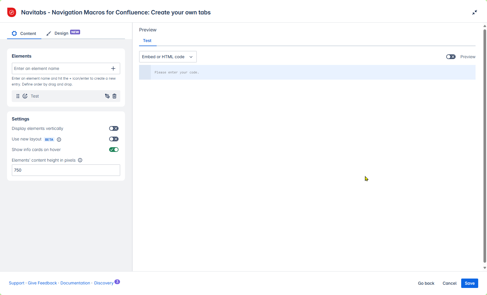
You can use an embed or HTML code as a tab.
Choose “Embed or HTML Code” in the drop-down menu.
Paste the code in the field below.
Use the “Preview” toggle to check whether the content looks as intended.
Tap “Save” once you are done.
iFrame
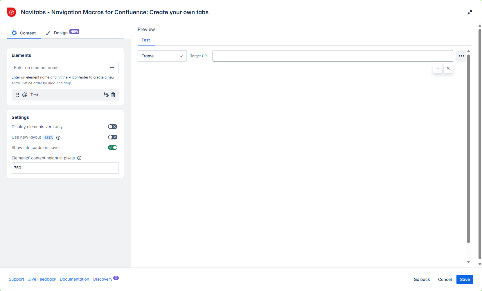
You can include an iFrame as a tab. This allows you to embed external content on your Confluence page.
An iFrame is an HTML element that embeds another HTML document within a page. The iFrame has its own scrollbars, borders, and content. Note: Not all websites allow their content to be embedded in an iFrame. If the content you want to embed is protected or restricted, the iFrame may not work.
Choose “iFrame” in the drop-down menu.
Paste the target URL.
By tapping the dots :more-dots: , you can specify the width and height of the iFrame in pixels or as a percentage of the parent container.Tap “Save” once you are done.
Confluence Content
Use this option to combine existing Confluence content with individual page content in a single macro. If you need a tab navigation of only Confluence pages, use one of the other options in the Tab Wizard ⤴️.
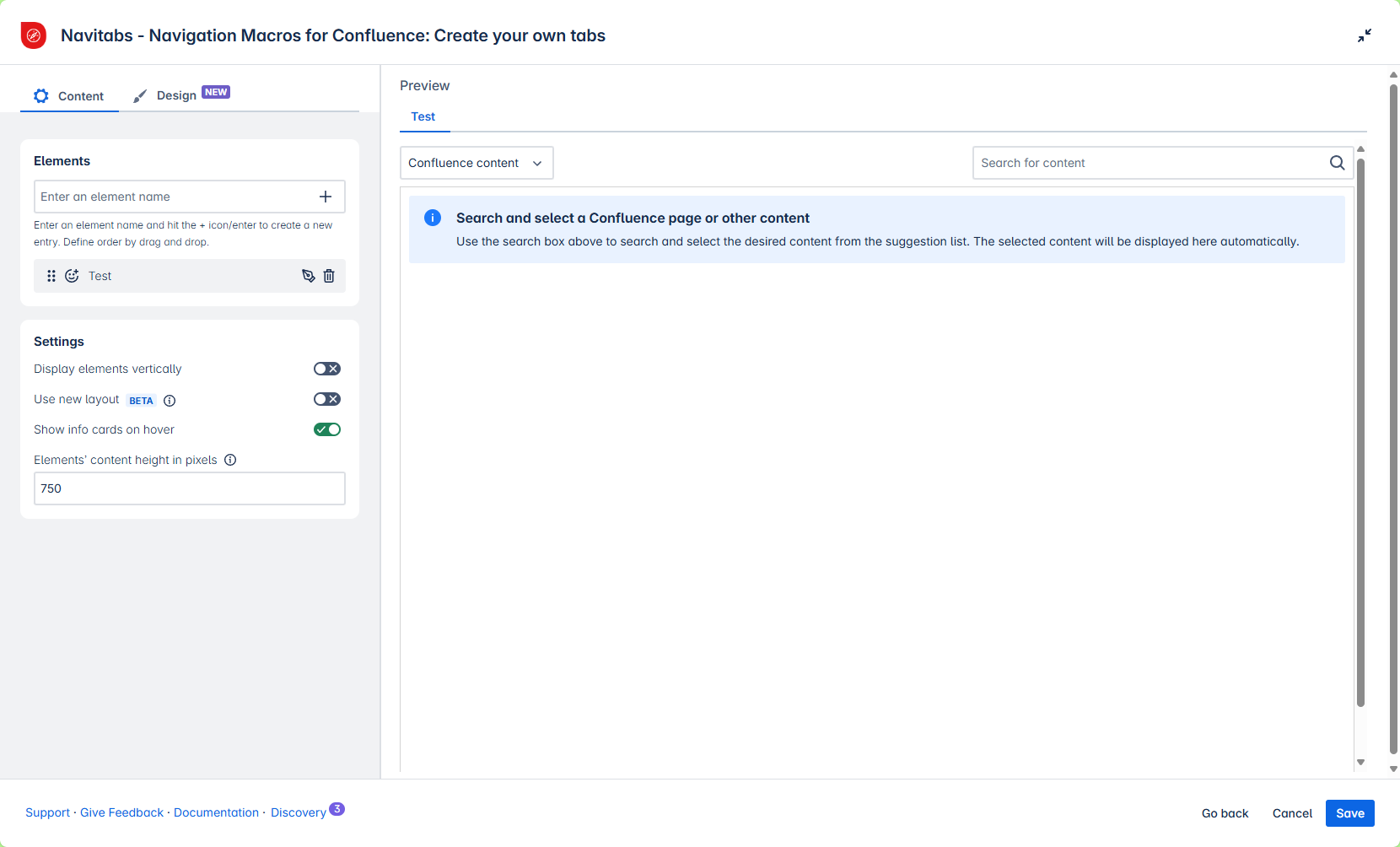
You can select existing Confluence content.
Choose “Confluence content” in the drop-down menu and search for the name of your content.
Content can be a Confluence page, whiteboard, database or smartlink*.
The preview of the Confluence page will appear in the editor.
⚠️ You cannot edit its content here.
Use other options in the drop-down for the different tabs in your navigation.
Tap “Save” once you are done.
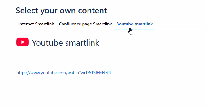
Please note: Smartlinks are currently not fully supported due to Cloud limitations.
Adding them as tab content will show only a URL.
To avoid this, consider placing the content (when possible) on a Confluence page and using that page as the source for the tab.